A look behind the scenes of a feminine, luxurious virtual CFO brand
The Background:
Barbara LaPolla is a Virtual CFO who offers accounting services for female entrepreneurs, creators, and coaches. Her journey in finance began over 10 years ago as a CPA. Barbara’s diverse experience and passion for helping women all came together in 2021 when she launched her business: Jase Accounting Solutions.
During the discovery phase of the design process, Barbara shared with me about how scary and overwhelming numbers can feel to her female clients. Over at JA, Barbara takes a complete approach to her client’s financials, not only looking at their historical data but strategizing and forecasting future earnings. She has a mission of making sure her clients feel empowered when it comes to their numbers.
The Struggle:
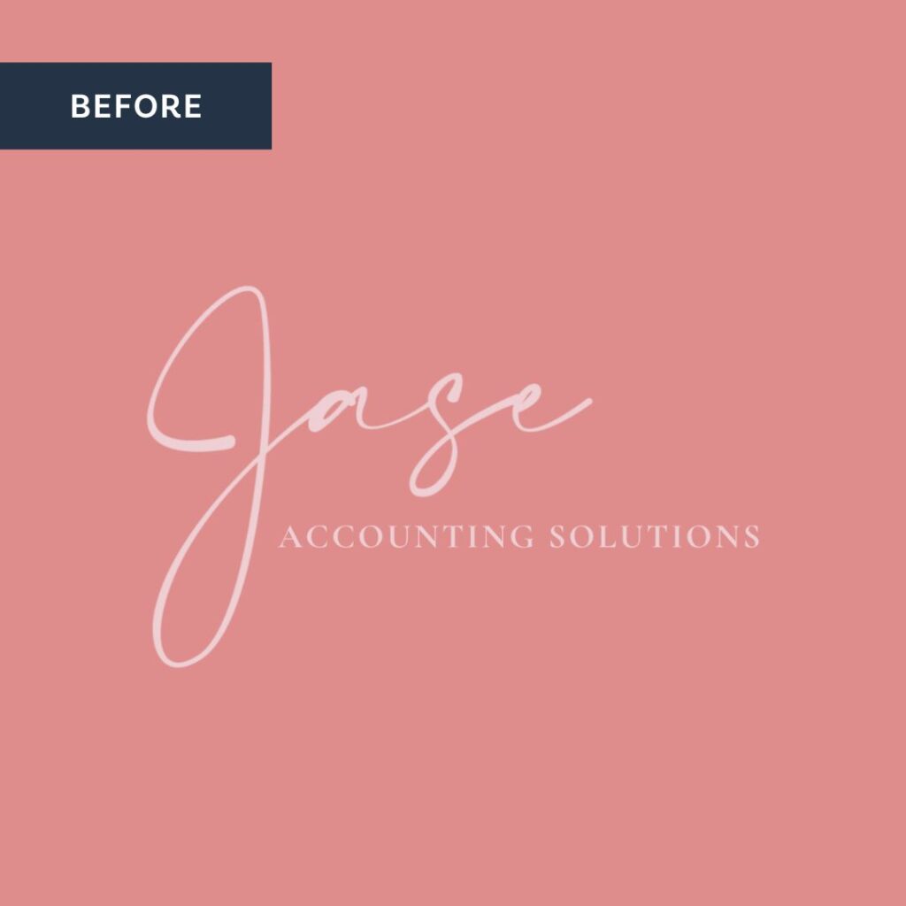
Like many new business owners, when Barbara originally started her business she purchased a cheaper logo, but quickly realized it wasn’t going to grow with her business.
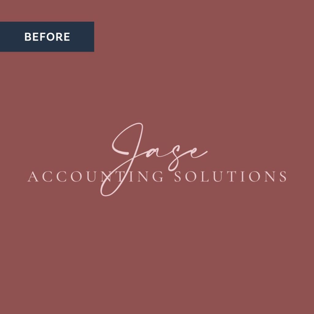
The original logos, fonts, and colors had some major limitations.
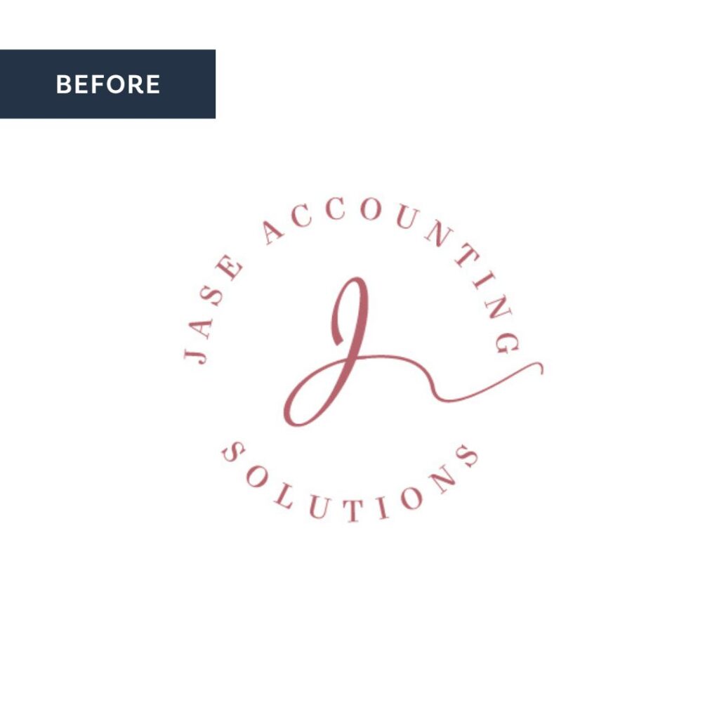
When it came to the logos, Barbara felt that the script font used for her primary logo was hard to read and the supporting logos had some fonts overlapping which, again, made legibility hard. In order to try to salvage her original logo kit, she ended up purchasing a round Fiverr logo which ended up making everything seem inconsistent.
Before I dive into the issues with original font selections, let me remind you that Barbara’s entire job revolves around numbers and math-related symbols.
So onto one of her most frustrating issues… The original body font (a font used for large bodies of text) had a dollar symbol that was so subtle it looked more like an S than a $. So much so, that she avoided using the symbol in all of her content creation. It had become a real problem! So new fonts were a HUGE priority during this brand refresh.
As for the colors, some of the original color options were very similar which made it hard to place certain colors together when she was creating graphics.
The Goal:
Even though Barbara had a lot of issues with her original brand designs, there was still a lot about the overall aesthetic that she really liked and we felt would appeal to her ideal audience. So instead of going with a total rebrand, we opted for more of a brand refresh. In this case, we wanted to make a few impactful updates to Barbara’s visual identity while keeping her business’s core essence, with the #1 goal being to bring more functionality to her visuals. We really wanted Barbara’s brand to feel feminine, luxurious, approachable, and professional, without the approachability being confused with amateur because Barbara is anything but inexperienced.
Additionally, Barbara’s business is named after her four children’s first initials (J-A-S-E). Since they are such a big driving force in why she does what she does, I wanted to find a way to subtly incorporate them into the design.
Finally, as I mentioned before, Barbara said that talking about numbers feels hard for many of her clients and they even can feel shame surrounding their business finances. That being said, we really wanted to avoid anything that was typically associated with finances and accounting. So things like percentage symbols, plus or minus signs, equal signs, etc… all those were a big no-no.
The Solution:
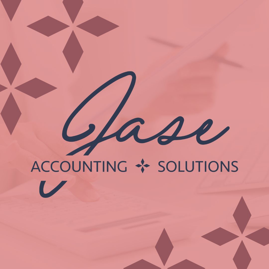
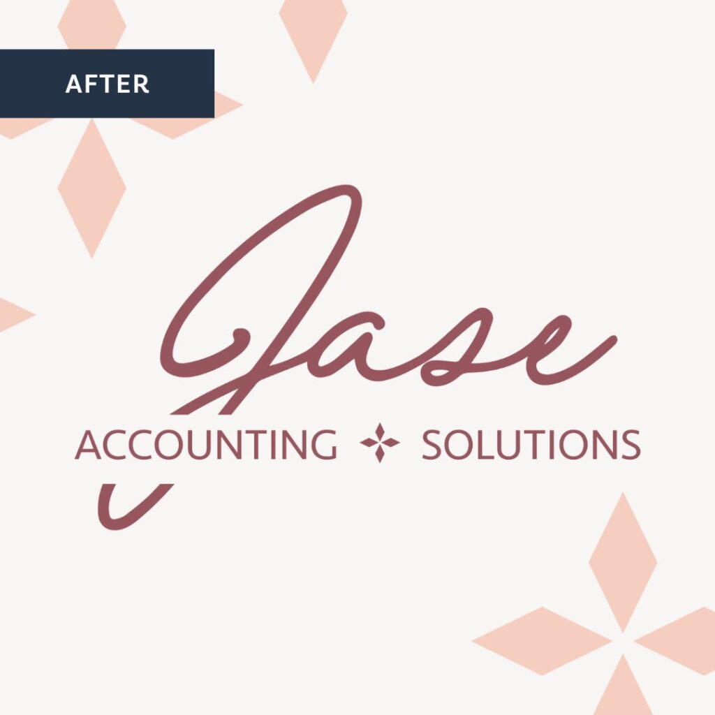
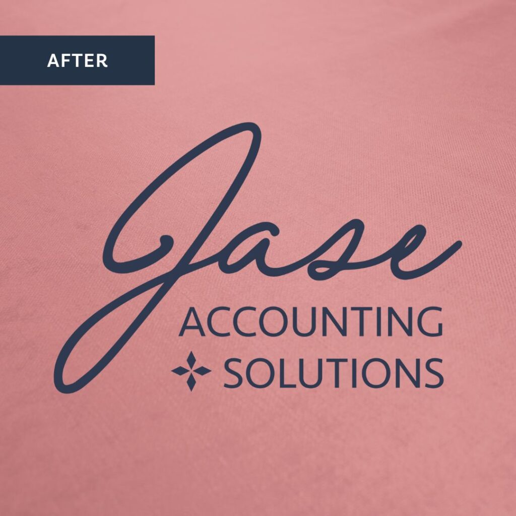
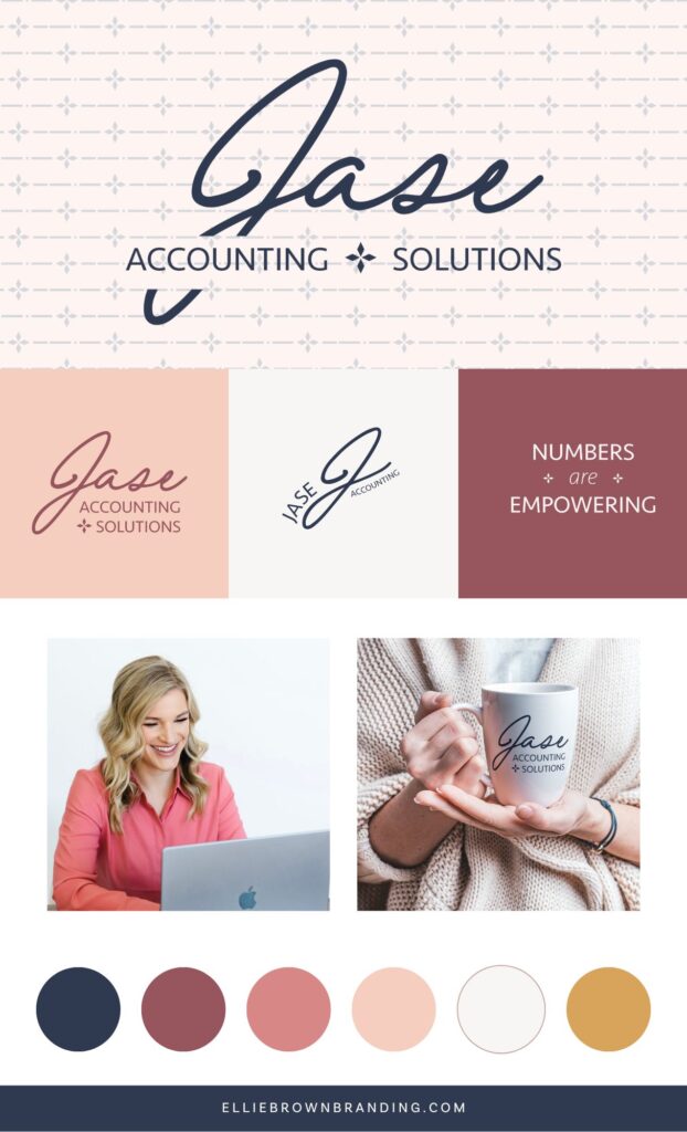
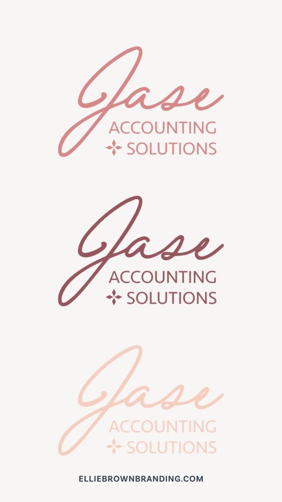
By selecting a thicker, handwritten-looking font and customizing it to make sure it was legible, I was able to create a more impactful, versatile, feminine feel for the Jase Accounting Solutions primary logo. This was supported by a modern, sans-serif font. The feminine aesthetic was further enhanced by selecting shades of coral, pink, and navy.
The range of pink colors that were selected were chosen for their calming effect on people. Pink isn’t aggressive like red, but rather suggests safety and vulnerability which made it a clear choice for a female-focused finance company. Also, the anchor color of navy is often associated with trust and stability (definitely something I would want if I was showing someone all of my biz bank accounts!). The brand color palette included cream and a pop of marigold.
The supporting fonts selected are a mixture of classic serifs and sans-serifs. While researching fonts, I looked at each individual number-related symbol thoroughly before making final font suggestions. No more “is that an S or a $ ?!” and Barbara can start pumping out all her valuable content with confidence.
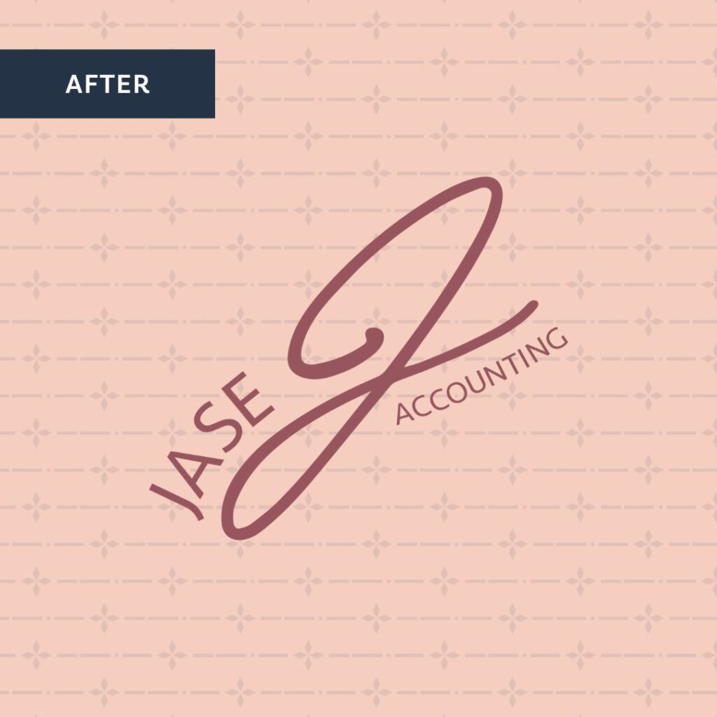
The last little touch to Barbara’s brand that has significance is the creation of the diamond icon. Typically in design, you will see odd numbers placed together because it is believed that things arranged in odd numbers are more visually appealing and create more energy. I wanted her supporting icon to have four of something to represent her four children which initially seemed problematic because of the whole odd-number concept. The diamond icon you see throughout her logos and patterns was a clear choice because it had four points and four individual diamonds were used to form one larger diamond which meant it remained symmetrical and followed the odd-number rule.
The patterns and icons really lend themselves nicely to Barbara’s high-end, elegant, feminine feel and you can see them already being utilized beautifully over on her social media and website.
The Results:
“Before I hired Ellie, my fonts and my logo didn’t reflect my brand accurately. They worked for when I was start-up, but as I was elevating my services, I wanted my brand to reflect that as well.
I think my favorite part about working with Ellie was the calls. They were crucial because a lot can get lost in translation and I feel like as the client it can be awkward to say “I like this, but don’t like that” and feel like we are offending the artist so hopping on a call and feeling at ease with being able to openly discuss what I liked/didn’t like was great.
If you are wanting your brand to be captured in a logo and other design elements work with Ellie who is thorough and meticulous about bringing your vision to life while elevating your brand.”
– Barbara, Jase Accounting Solutions owner
Are you ready for a brand that finally feels like you?
If you are currently where Barbara was, ready for a brand that attracts high-end clients, I’ve got you! All of my brand design clients have the option to add on additional services such as website design or collateral design. My brand design process helps you show up confidently online and charge premium prices.
