Welcome to the world where letters do more than just spell out words—they build brands, evoke emotions, and create lasting impressions. OK, was that too much? If you’re on the hunt for that perfect blend of art and strategy to make your brand stand out, you’ve come to the right place. Today, we’re gently peeling back the layers of the art of typography logos. I will share insights from my experiences and the thoughtful attention to detail that goes into creating them!
And hey, if you’re looking for a brand or website designer who can bring your vision to life with flair and precision, I’d be thrilled to be considered. Contact me here to get started.

What are Typography Logos?
First, a typography logo is a brand’s identity encapsulated in letter form. Instead of something like an icon, symbol, or drawing, it’s when your logo is “just” your brand name typed out (or at least, that’s what makes up the majority of the logo!). Behind the surface though, typography logos are where font meets design to tell a story, convey brand ethos, and engage audiences.
But why opt for a typography logo? Simplicity, versatility, and identity. These logos cut through the noise with a clear, impactful design that’s easy to apply across various media. From business cards to billboards, a well-designed typography logo ensures your brand name is recognized and remembered!
On top of that, it’s worth mentioning that some of the most iconic brands we know by their symbols today (like Starbucks, Apple, or Target), didn’t start with an “icon only” logo. Instead, they started with an icon in addition to a typeface logo of their name, until they became so recognizable they were able to drop the name portion of their logo altogether.
Exploring Examples of Creative Typography Logos
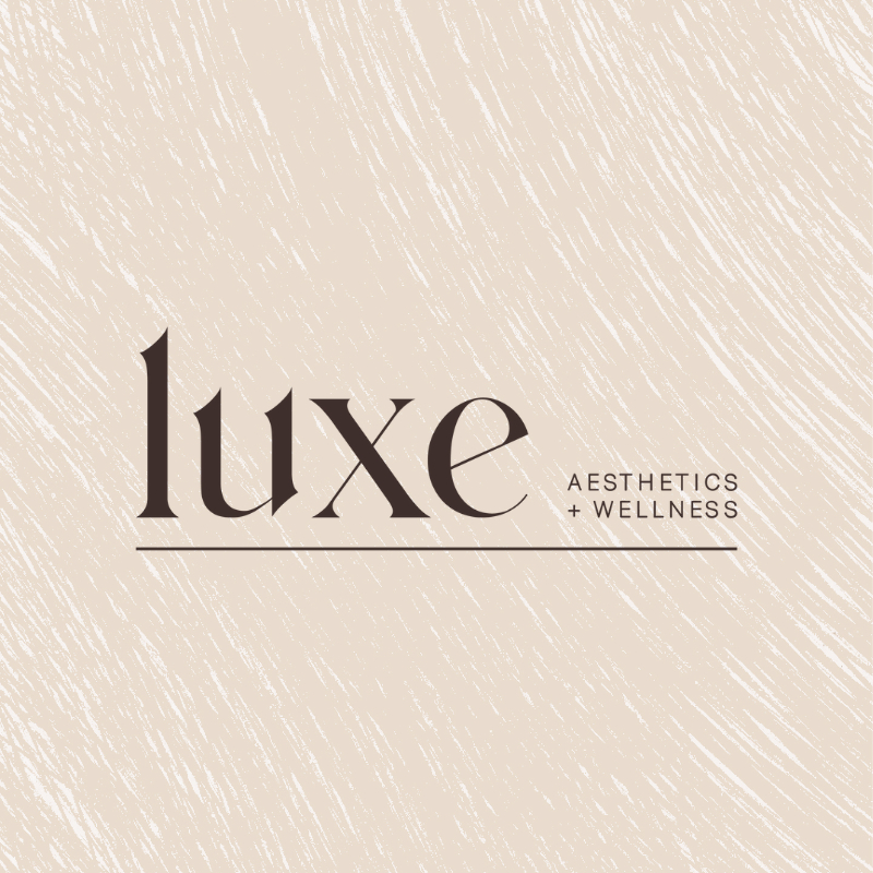
In my own portfolio, I’ve had the pleasure of crafting typography logos for all sorts of brands (you can browse a few of them here!). Among these, one of my favorites was the branding and website design of a new Colorado med spa. This wasn’t just a facelift; it was a deep dive into the essence of their brand. Aimed at embodying the contemporary, serene, and luxurious experience they offer. The choice of font played a pivotal role here. I opted for a font with gentle, subtle curves that whispered rather than shouted, mirroring the soothing and welcoming ambiance of the med spa itself.
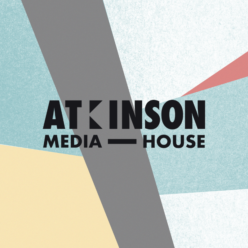
In another project, I worked with a videography and marketing agency that was a hidden gem, just waiting for its moment to shine! With a fresh branding overhaul and a sleek new website design, we polished that gem into the powerhouse it always was (previously hiding behind a generic Fiverr logo!).
Suddenly, they were not just attracting clients; they were attracting the RIGHT kind of clients. Those who were ready to pay top dollar for top talent. Ultimately, it’s projects like these that truly showcase the magic of typography—it doesn’t just capture a brand’s essence; it amplifies it, broadcasting it to the world in bold, unmistakable letters.
Curious about whether your brand is craving a sleek website redesign or a complete branding makeover? I’ve delved deep into this topic, unpacking every detail, right here.
Typography Logos: Different Types of Designs for Unique & Iconic Brands
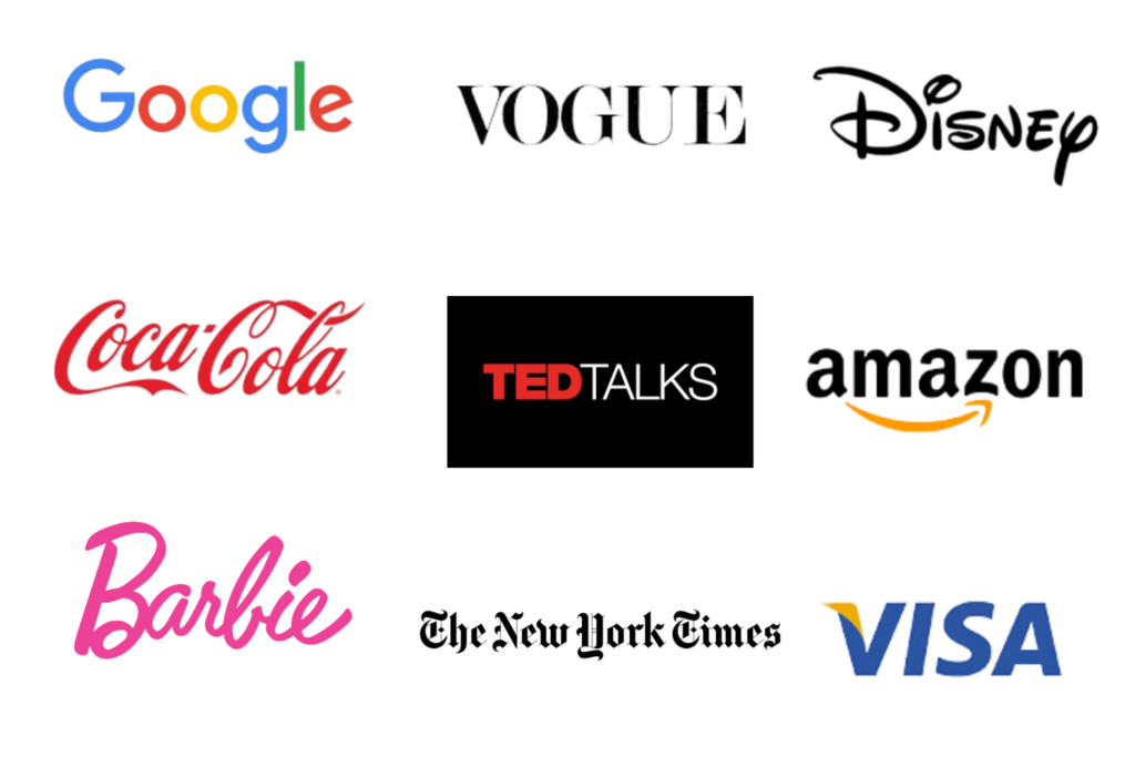
Next, let’s address the idea that with a typeface logo it’s hard to show off your personality or stand out in a crowded space. I couldn’t disagree more! But instead of explain what I mean, I thought I’d show some examples (and bring out the big guns!). Below, you’ll see the distinct personalities of brands like Barbie, TED Talks, The New York Times, Coca-Cola, Vogue, and more!
Each utilizes typography logos, yet they couldn’t be more different. Barbie’s playful script speaks to imagination and dreams, while The New York Times’ classic serif commands respect and authority. This diversity illustrates the power of font choice in logo design. It’s not about knowing every font out there but about identifying what resonates with your brand and trusting your designer to tailor it uniquely to you (there’s more to a typeface logo than what meets the eye!).
The Color Palette: Bringing Life to Your Logo Design
Now that I’ve shared just a few of my thoughts around typeface logos (I could go on and on!), let’s talk about COLOR. What colors come to mind when you think of logos like Google, Nutella, IKEA, and Marvel? Each of these brands masterfully uses color to create a well-loved brand identity and add some recognition to their typeface logos. Just like selecting the perfect font, choosing your colors is a deep dive into your brand’s soul, aiming to resonate and connect with your audience on a more intimate level (whether that means using something bright, fun, and approachable, or strategically using muted tones to appear professional and authoritative).
Not Just a Font Choice—A Strategic Brand Decision
Remember, selecting a typography logo isn’t merely about aesthetics; it’s a strategic brand decision. It’s not the client’s job to study every font available—it’s their job to dream and define their vision. As designers, our role is to interpret this vision, bringing it to life with our expertise and creativity. Trust in this partnership is crucial. Together, we can craft a logo that not only stands out but also stands FOR something. And contrary to what you think – a typography logo can take just as much time to design and perfect as one with a motif!

Let’s Create Something Remarkable Together
Ultimately, these logos are more than just pretty designs; they’re the heart and soul of your brand identity. With the right design partner (psst: this could be me!), the possibilities are endless.
If you’re looking for a brand or website designer who can merge creativity with strategy to create something truly remarkable for your business, I’m just a click away! Let’s join forces to make your brand not only seen but felt and remembered.
