In a world cluttered with information and visual stimuli, the power of a minimal logo design cannot be ignored. This strategy (and yes, less IS a strategy), can really help set your brand apart in a competitive landscape. Diving into the chic and impactful world of simplicity, today, I want to share my opinion as a brand designer on why a sleek, minimal logo could be the secret weapon your brand has been searching for. So, buckle up—we’re about to discover how, in the branding universe, embracing the “less is more” mantra can truly elevate your business!
If you’re considering a new website launch or a rebrand, I’m here to guide you through. Contact me here to get started!
Why Minimal Logo Design is So Effective
Minimal logo design is not just a trend; it’s a strategic approach that businesses are embracing to cut through the noise. It’s about distilling a brand’s essence down to its core, making sure it’s recognizable at a glance. This is crucial because, let’s face it, our attention spans are shorter than ever! A minimal logo design does the heavy lifting by being easy to spot (and remember), and it also scales beautifully across different mediums (from your website banner to your printing collateral or signage).

The Unique Challenge of Logo Design: Simplify, Simplify, Simplify
While you might think it’s “easier” to design a minimalist logo, the truth is that it’s often the opposite! A logo must be instantly recognizable, whether it’s peeking out from a smartphone screen or emblazoned across a billboard. Its design needs to be versatile, scaling seamlessly across a myriad of sizes without losing its essence or impact. That can be easier to do with something like a simple typeface logo than it would be with something with more going on. It’s worth it though!
Icons of Minimalist Logos Done Well
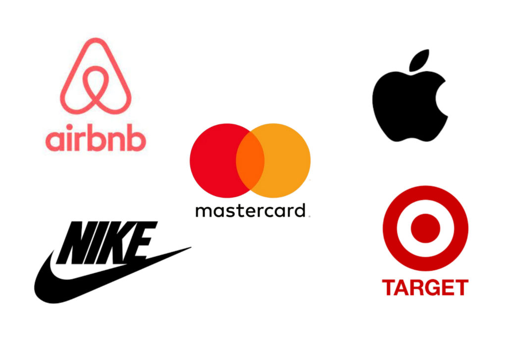
I know that most of you reading this aren’t brand nerds like me, so I thought I’d share some pictures of brands doing this well! Let’s take a moment to appreciate some of the champions of minimal logo design:
- Mastercard ditched the numbers and went for interlocking circles with vibrant colors. This ends up conveying connectivity and universality without the need for words.
- Target’s iconic red and white bullseye logo is the epitome of ‘less is more’, and it ends up making them instantly recognizable.
- Airbnb transformed the concept of belonging into a simple, curvy design that encapsulates love, people, and places. In this way, it’s not just a logo; it’s a story. But it’s also incredibly minimal in design.
- Apple took the bite out of complexity (haha!), offering a sleek icon of innovation and elegance. It’s minimal, yes, but it’s one of the most recognized brands in the world.
- Lastly, let’s talk about Nike’s iconic swoosh. This hallmark of minimalistic design, symbolizes motion and achievement with sleek simplicity.

Wondering how to create a new luxury brand? Check out my blog here.
Navigating the Pitfalls: What Not to Do in Minimal Logo Design
While minimalism seems straightforward, it’s easy to stumble. Here are some common mistakes to avoid:
- Over-simplification to the Point of Being Generic: Sure, it’s minimal, but is it memorable? Avoid using a font or design so simple that anyone can claim it.
- Looking Too Much Like the Competition: Inspiration is great, but imitation? Not so much. Your logo should distinguish you, not make customers think they’ve seen it before.
- Forgetting Scalability and Versatility: Your logo should look as stunning on a business card as it does on a billboard. Make sure when you hire a brand and website designer, they can design with multiple platforms in mind.

Wrapping It Up: Embrace the Power of Minimalism
At the end of the day, minimalism in your logo isn’t just about design preference; it’s about making a bold statement of your brand’s clear vision and unique personality. In an era where everyone’s vying for attention, a minimal logo serves as your brand’s chic whisper in a room full of shouts. It’s a celebration of the ‘less is more’ philosophy, crafting an identity that doesn’t just stand out but sticks around, proving that sometimes, the simplest touch can indeed leave the deepest impression. And trust me? IT WORKS when it’s done well.
As a branding and design expert, I’m here to help you bring your vision to life and set you apart from the competition. Reach out to me today to discuss how we can collaborate on your next website or branding project and take your online presence to the next level. Together, let’s make your brand the beacon of simplicity and elegance it deserves to be!
